theWambuidesign · Studio notes · Nairobi
Building theWambuidesign
Notes on designing, coding and shipping my own site — the structure, the decisions, and what it’s like to build a product end to end with AI in the workflow.

The brief
One job, three kinds of visitor
This site isn’t a gallery. It exists to turn three kinds of people into a first conversation: funded startups building for African users, international teams entering these markets, and established businesses that need a refresh or a growth push. Every decision below was measured against that.
Ideation
Paper first, then structure

The structure it became
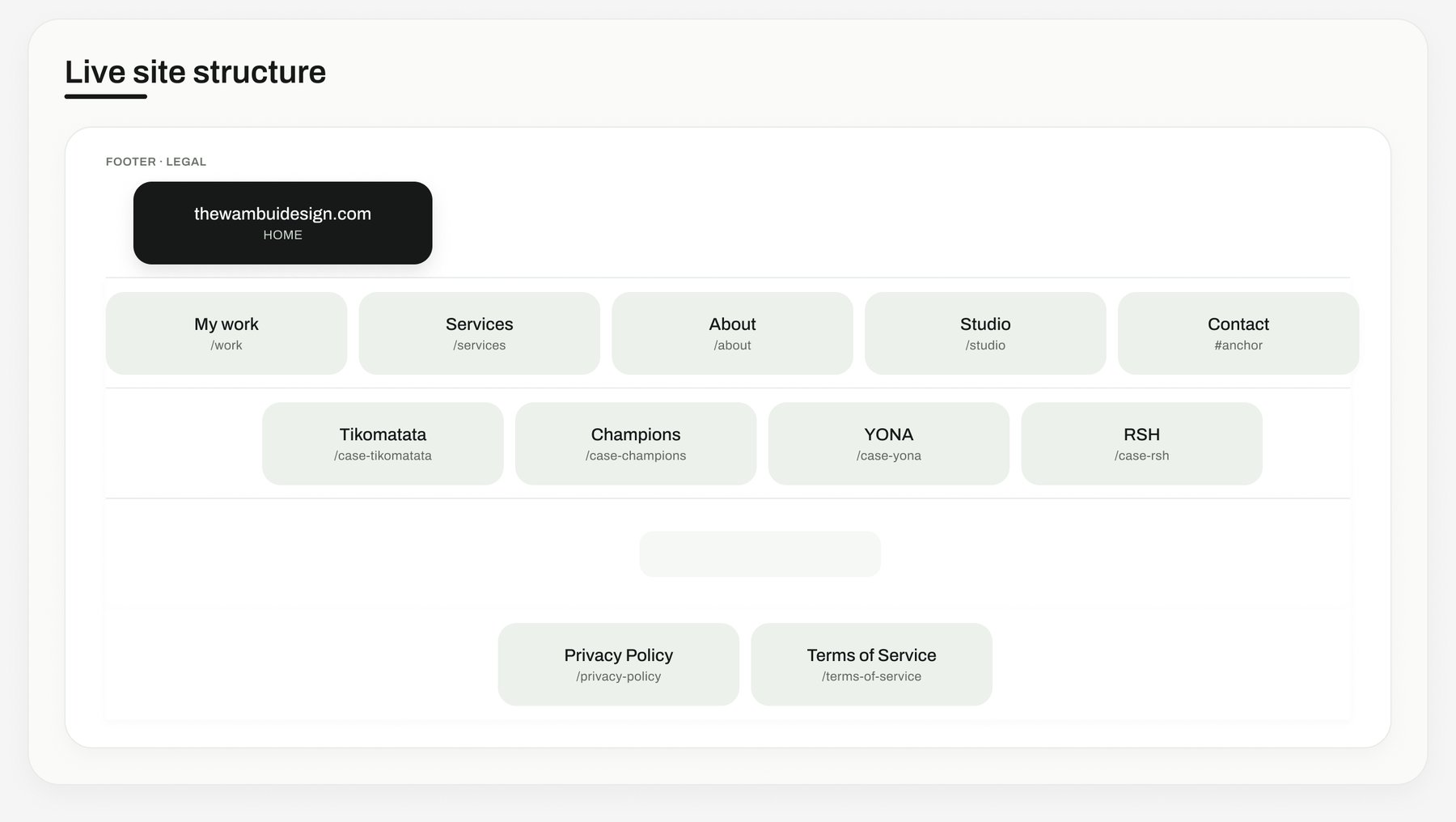
The designs
From sketch to shipped page
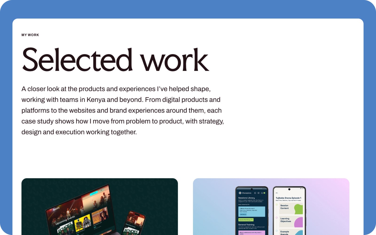
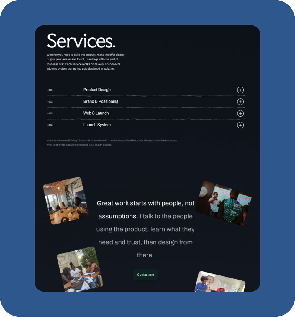

The wireframe's structure held all the way to build — real pages, not templates, in the same shape they were on paper.
Working with AI
Designing and building with AI
I work the way a designer works now, not the way one worked five years ago. AI didn’t design this site — I did. What it changed is the distance between a design decision and a working product: I could build and ship something I would previously have had to hand over and wait on.
Direction
01
I made the positioning, structure and visual decisions myself. That judgment is the part that doesn’t get delegated.
Claude Code
02
I built the front end with Claude Code — translating my Figma designs into real, working components rather than a template.
ChatGPT
03
Used for filling gaps in the build: explaining unfamiliar territory, walking through approaches, unblocking me when something broke.
Judgment
04
Every output got reviewed against the design. AI accelerates execution; it doesn’t get a vote on whether something is right.
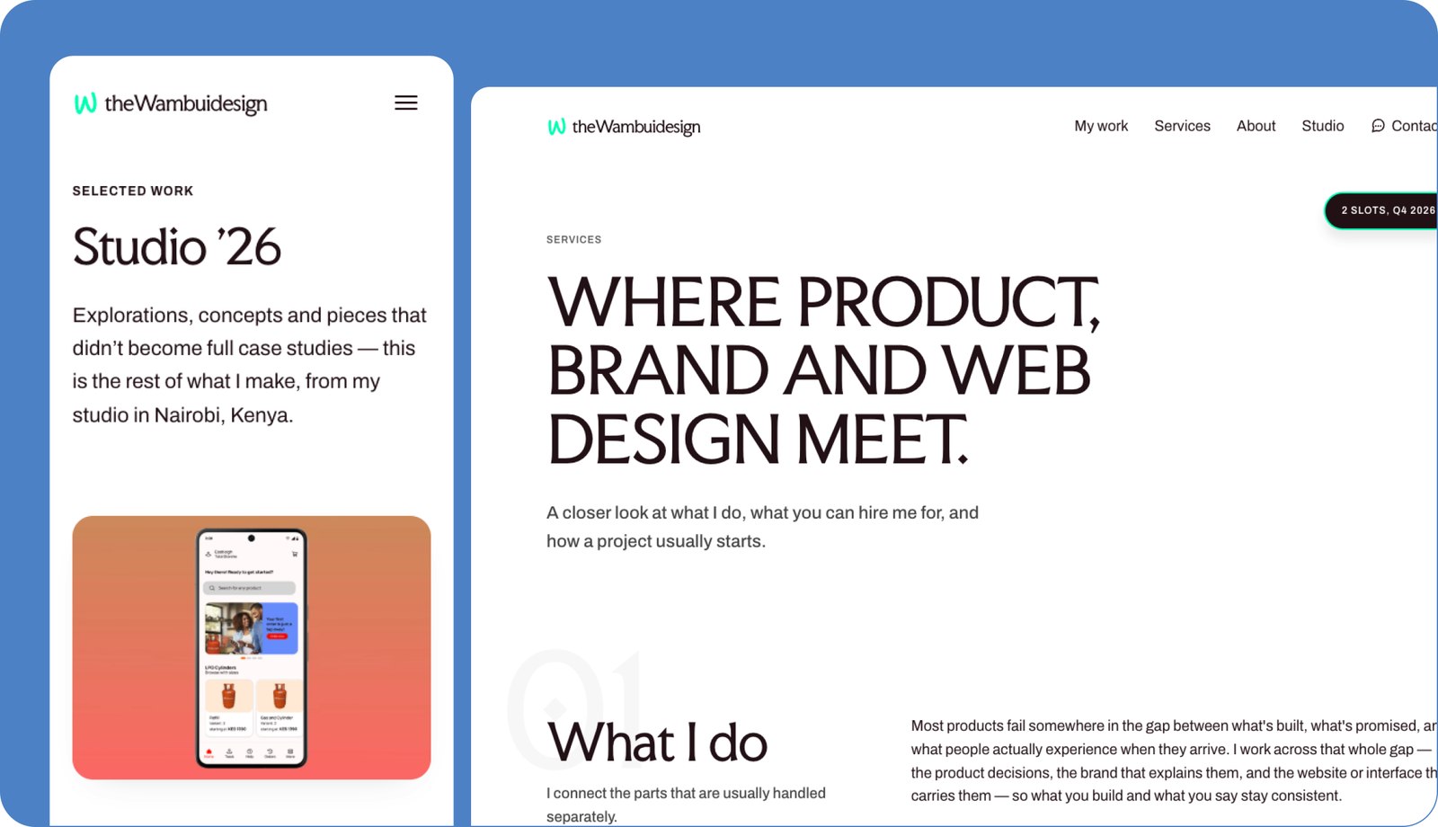
Responsive & accessible
Built for how people actually browse
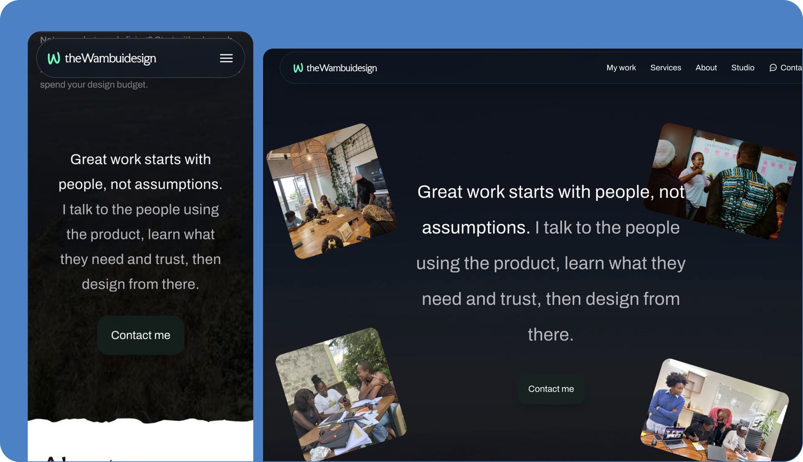
The same type, spacing and structure hold at any width and on any page — Studio narrow beside Services wide, both still clearly the same site.
Build & ship
From design file to live site
Design, code, version control, deployment — all of it myself. A designer who can ship understands what they’re asking engineers for, and can move without waiting for a team when there isn’t one.
Design
01
Figma — design system, components, responsive specs.
Build
02
Claude Code — front-end build from the design file.
Version control
03
GitHub — the repo as the source of truth.
Hosting
04
Netlify — continuous deployment, live in minutes.
How I work
Why any of this matters to you
You’re reading the site itself. The site is live, the structure held from wireframe to build, and the process above is the same one I’d run on your product. If you’re launching something, entering these markets, or refreshing a business that’s outgrown its current site — this is what you’d be buying.
Decisions, not decoration
01
Positioning and structure come before visuals, every time.
Field research
02
Real users in real markets — not assumptions made from a desk.
Design to shipped
03
Figma through to a deployed, responsive, accessible site.
Current tooling
04
AI in the workflow where it earns its place, judgment kept with me.