Tikomatata · Co-founder & Creative Lead · Sole Designer · 2023
Designing an event discovery platform — from brand to product to website
Tikomatata is an event ticketing platform for the Kenyan market, and a company I co-founded. As creative lead and the only designer, I owned every design decision across brand, product and marketing website — designed as one connected system — and led the handoff to the dev team, supervising the build to keep it aligned with the designs.
It’s the same system I now run as The Launch System for other founders.
- in ticket sales in year one
- $100K+
- surfaces — brand, website, product — built as one system
- 3
- experience
- Mobile-first
01 · The opportunity
A market full of sameness
In Kenya’s digital event landscape, most ticketing platforms followed the same conventional patterns — generic layouts, undifferentiated branding, and functional-but-forgettable experiences. Tikomatata saw an opportunity to break from this mold.
The goal was not just a better interface, but a distinctive platform with its own identity — one that could build recognition and trust in a market where no ticketing brand had established real visual ownership.
The redesign needed to accomplish three things simultaneously: establish a brand identity strong enough to be recognised, create a product experience engaging enough to retain users, and build a website compelling enough to convert visitors into ticket buyers.
02 · The problem
Three surfaces, one experience — none of them existed yet
The original Tikomatata design had conformed to the same standard as every other ticketing site in the market. It worked, but it was invisible — nothing about the product or its presentation communicated why someone should choose Tikomatata over any alternative.
1 · Brand
No visual identity existed beyond a basic logo. The platform had no personality, no graphic language, and no system for creating recognition across touchpoints.
2 · Product
The ticketing flow worked but offered nothing distinctive. The experience needed to feel purposeful and considered — particularly the mobile experience, since users would discover events on social media.
3 · Website
There was no dedicated marketing experience. The product needed a front door that could communicate its value proposition and move visitors from interest to purchase.

03 · Discovery
Understanding the landscape before redesigning it
The analytical work behind the critical product and design decisions I made. By studying the local Kenyan market, user behaviours, and brand structures, I found the path forward.
Market audit
Every platform looked the same
An audit of Kenya’s event ticketing landscape revealed a market of near-identical platforms. Generic layouts, undifferentiated branding, and purely functional interfaces meant no single platform had established real visual ownership. This wasn’t just a design problem — it was a positioning opportunity. If every competitor looked interchangeable, the first platform to invest in distinctive design would own the space.
User behaviour
Discovery happens on mobile, on social media
Most users encounter events through social media — scrolling Instagram or WhatsApp on their phones. This meant the mobile experience couldn’t be a scaled-down version of the desktop site. It needed to feel native, purposeful, and optimised for the way people actually discover events. The entry point to the product was a poster on a feed, not a homepage on a laptop.
Brand gap
No identity beyond the logo
Tikomatata had a name and a basic logo, but no visual system — no colour language, no typography direction, no graphic patterns, no consistent voice. Without a brand system, the product couldn’t build recognition across touchpoints. Every poster, every email, every screen looked disconnected. The redesign needed to start from brand fundamentals before touching a single interface element.
The redesign wasn’t about making the old site prettier. It was about building a product ecosystem from brand up.
The brand
A visual system, defined before the interface
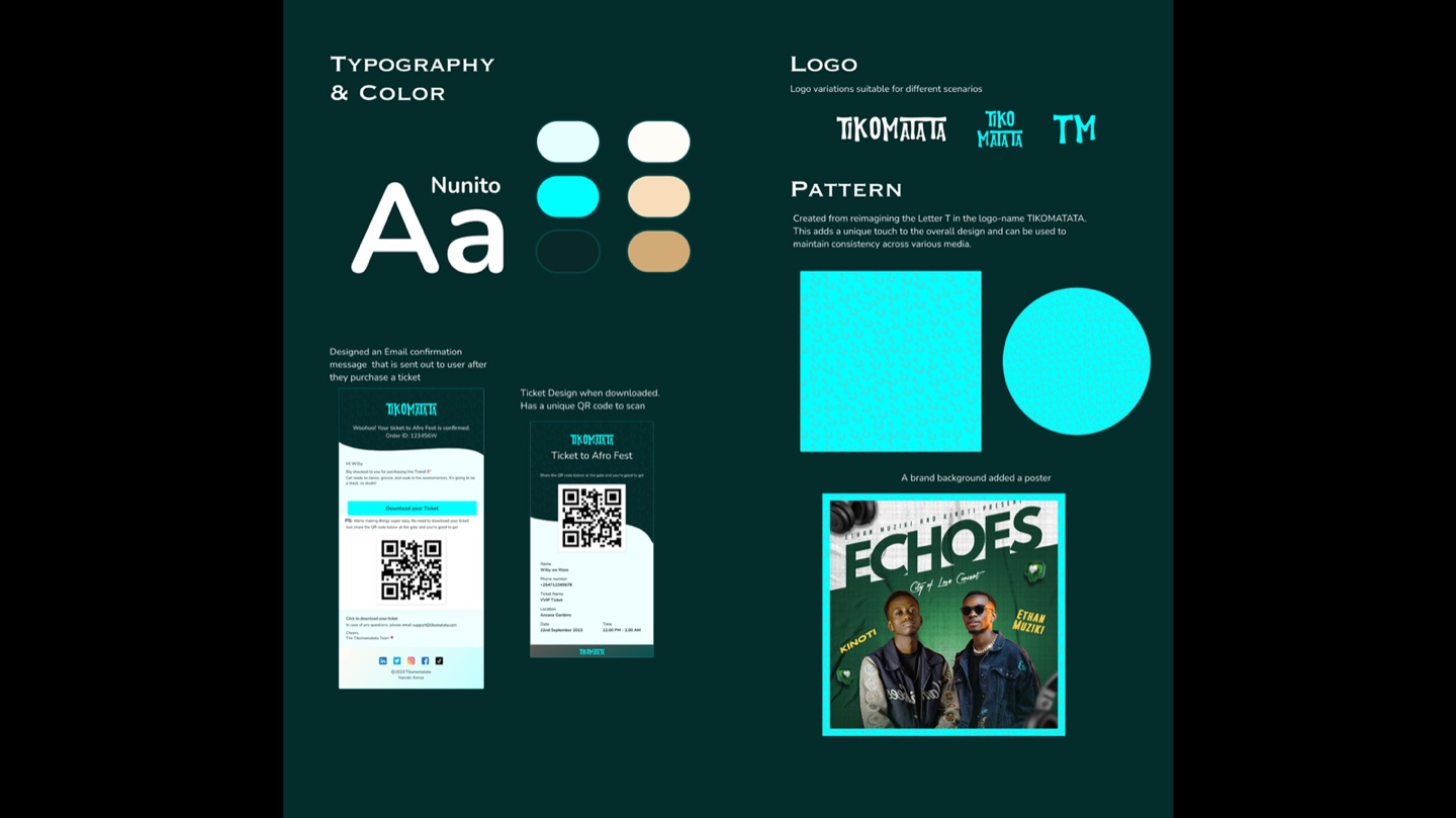
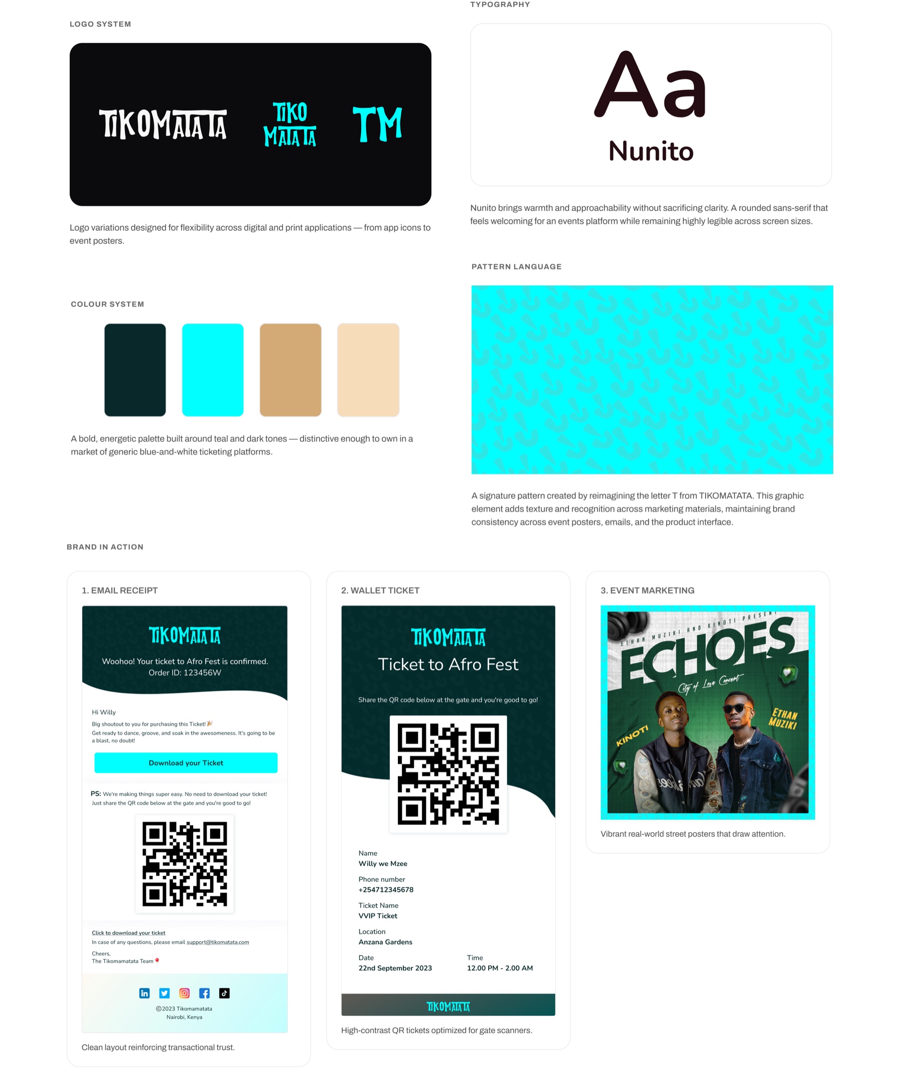
Logo set, typography, a teal-and-dark colour palette and a signature pattern — a ‘T’ from TIKOMATATA reimagined as a repeating graphic — were established first, so every later decision had something to be consistent with. Nunito, a rounded sans-serif, carries the warmth of an events brand while staying legible at any size. The identity then had to hold beyond the screen: on email receipts, on downloadable wallet tickets with gate-scanned QR codes, and on printed street posters.
Desktop experience
Browsing that feels curated, buying that builds confidence
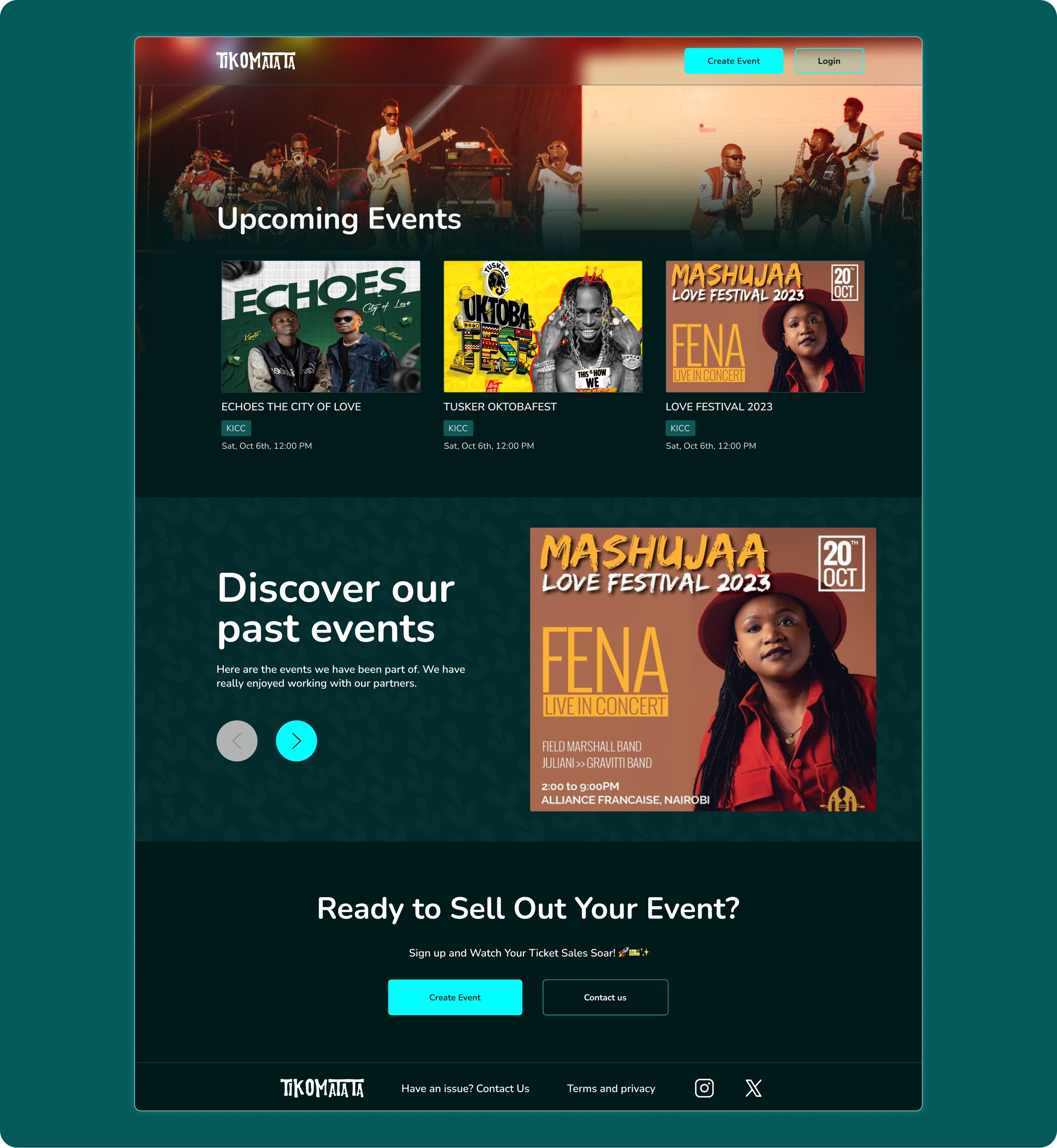
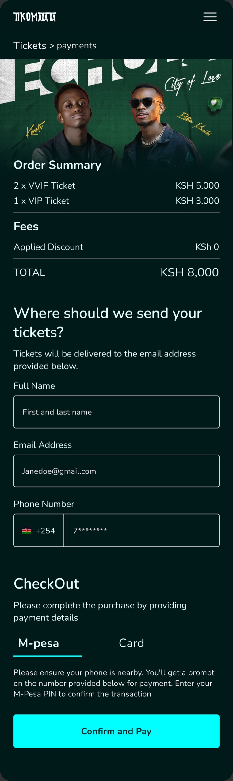
The redesigned website introduces Tikomatata with impact — a hero section that sets the tone, an events discovery flow that makes browsing feel curated, and a purchase flow that builds confidence through clarity and brand consistency.
Mobile experience
A native-feeling app, not a shrunk-down website
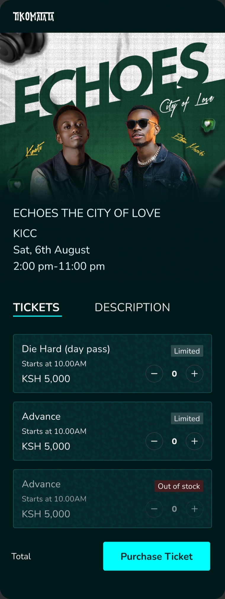
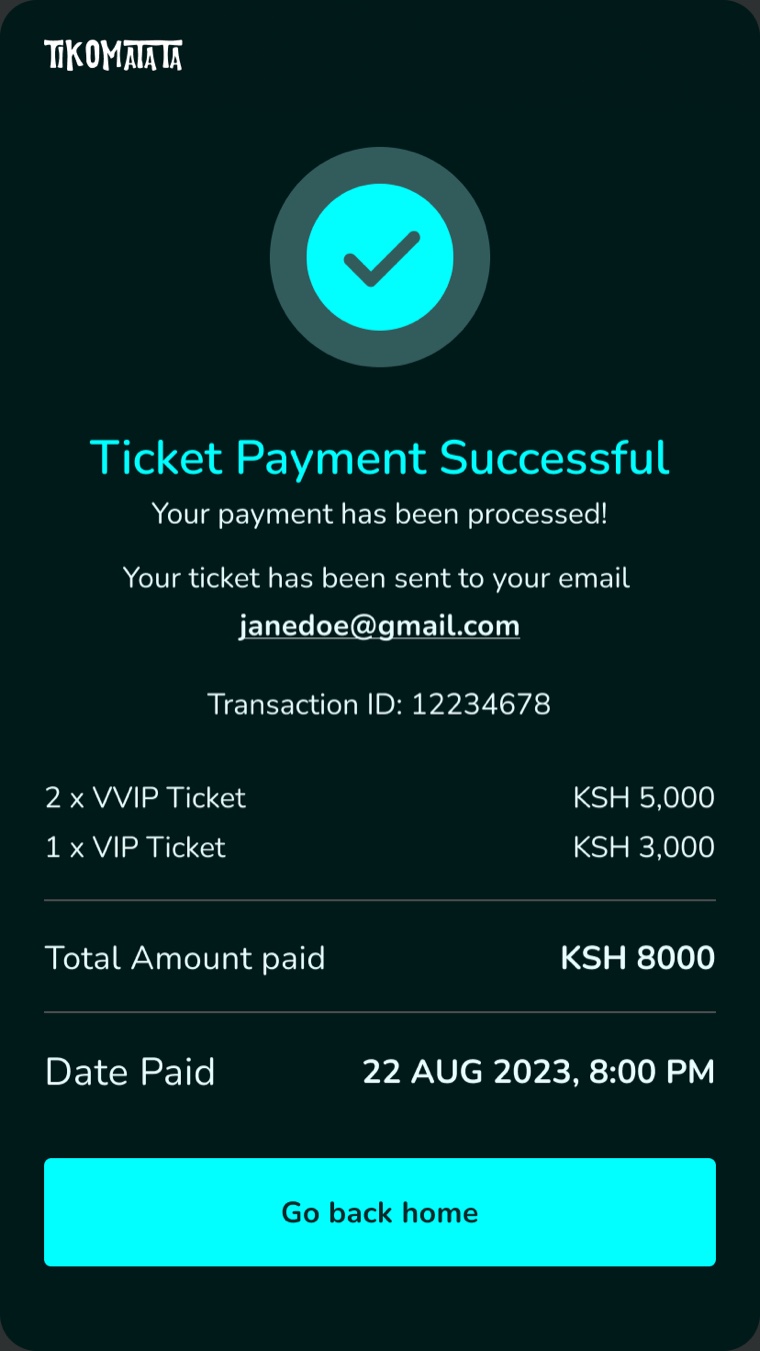
Since most users discover events through social media on their phones, the mobile experience needed to feel like a native app — not a responsive website. The same brand identity carries across, but the interaction patterns are reimagined for thumb-driven, single-task flows.

10 · Outcome
What this changed
The platform contributed over $100K in ticket sales in its first year. That is the number I care about, because it is the one a founder is actually buying: not better-looking screens, but a brand, a product and a site that together convinced people in a market with no shortage of alternatives to hand over money.
$100K+ in year-one ticket sales
Sold through the product, the website and the brand as one funnel — discovery on social, purchase on mobile, confirmation by M-Pesa and email.
Cross-platform consistency
Desktop and mobile experiences share the same visual language while being optimised for their respective contexts — discovery-focused browsing on desktop, social-media-driven purchasing on mobile.
Scalable brand system
The brand extends beyond the product into event posters, email confirmations, downloadable tickets, and marketing materials — every touchpoint reinforcing recognition.
A brand that survived contact with the street
The identity had to hold on event posters, wallet tickets and gate-scanned QR codes, not only on screens. That is where most ticketing brands in this market fall apart.
11 · Reflection
What I do differently now
Brand before interface
01
Visual identity is not a layer applied after the product is designed. Establishing colour, typography, pattern and personality first gives every later decision something to be consistent with. I now start every engagement here, before a single screen.
Cross-platform means cross-thinking
02
Desktop and mobile are two experiences, not two breakpoints. Mobile needed its own interaction logic because that is where discovery actually happens — on social, on a phone, in a queue. I scope them as separate design problems now.
The website is part of the product
03
The marketing site and the product are the same experience seen from two angles. The site makes a promise; the product keeps it. When different people build them at different times, the promise and the delivery drift — and the founder pays for that gap in conversion.
Craft as competitive advantage
04
In a market where every platform looks interchangeable, craft is not decoration — it is the trust signal that gets a stranger to enter their M-Pesa number. For founders entering a market that has not seen serious design yet, that is the cheapest advantage available.